How Animations can lead to great UX Designs

Animations for UX Design

Do you think good visuals and an appealing user interface is enough to keep people hooked to your app?

Think again!

With smartphones establishing their existence in the pocket of almost every individual, the number of mobile applications has been steadily increasing. Such a situation has made it very difficult for mobile apps to stand out with something unique on offer.

This is where animations have upped the game for many applications. Without enough animations, even the best interfaces will only lead to confusion among users and instil a feeling where they are choosing things directly without any context. Nicely done animations prove crucial to enhance the user experience of your design and deliver the users a satisfying, smooth and delightful overall experience.

Animations can use and combine the sound and haptic features in mobile applications, enabling the general experience to be much more close to reality with a considerable reduction in the cognitive load as well. The pressure is less because animations make it easier to recognize every connection and context pretty quickly when using an app.


Principles of Creating Animated Interfaces

Here are some of the principles which are unavoidable when you create animated interfaces. Regardless of the tools, techniques, and framework you use, these principles will come in handy.


1) Attention and Focus:
The most significant objective of any animation in your app is to give a context and also direct the focus of a user to critical elements for a more fluid experience. The screens which seem without any connection can be seamlessly merged to assist the user in navigating while using your website or app.

To get the maximum impact from the animations on your app, you need to learn the art of restraint. Admittedly, it is a tempting prospect to exhibit a lot of animation on every single screen on your app. If you get carried away then the core motive of including animation gets lost in the process.


2) Order and Hierarchy with sequences:
If you are pondering to animate every element in your user interface, your thought process may incline in the wrong direction. While the right set of animation will focus the attention of a user inevitably, too much of it on a single page will also divert the attention.

However, if you still want to animate multiple elements on a single screen, you should always use a small delay in between them. Ensure that the ease and duration of animations are consistent. The entire process of this timing and delay in animation is known as the choreography principle of Material Motion.


3) The right kind of speed:
The speed of the animation in an app is generally controlled by modifying the duration of the animation. It is the duration of animations which either makes or breaks a great user experience.

Follow the general rule and try to incorporate animations which have a duration of 0.3-1 second. The animations lesser than 0.3 seconds feel as if they don’t even exist because you can easily miss the transition.

Also if a user can notice them, such speed can easily confuse the app user. Even animations that are longer than 1 second do not have too many fans. Animations can feel very slow and prove as a barrier to smooth interaction between the users and the interface.

The most significant advantage of using snappy and quick animations is that your app feels faster and more responsive. If the animations lag a lot, your app will feel slow and broken, which is going to make the overall experience of using the app an unpleasant one.

The speed we are talking about is not just limited to the duration of the animation but also applies to the lag which happens between the first swipe gesture and animation which follows next.


Understand the Physics involved:

Nothing in this world starts or stops instantly. It always takes a considerable amount of time for things to speed up or slow down. Forces like friction, remember?

An ideal animation is natural in its behavior, which also helps to ease the cognitive load on a user in understanding and using the application. Other than the duration of animations, you should also familiarize yourself with the different kinds of easing that is used in the design:


1) Linear:

This is the animation which is brought to use without any easing. It is also the most unnatural, so limit its use to only when very necessary.


2) Ease-in:

Ease-in is an accelerated easing. The animation here begins gradually and ends quickly.


3) Ease-out:

Now it is the opposite of easing in. It is decelerated easing. The animation starts very quickly and slows down a bit at the end. This is the best option as the quick start lends a sense of responsiveness in the app and provides a natural slowness in the end.


4) Spring:

Spring is an animation which ends on a bouncing note. It is used in a large number of modern mobile applications due to its responsiveness and vibrancy. Once you close on the right kind of animations which are needed in your app, you will be able to extend the natural world into the devices of people, which is always better than a strange and abstract experience.


Conclusion:

Based on the above discussion, you would have clearly understood how animations are a crucial part to create a great user experience without too much last-minute thinking.

Keep animation and the interaction in your mind right from the beginning so that the focus on overall experience remains constant during the entire process of product designing.

The principles discussed are timeless. If you are getting familiar with animations or are fully aware of them as well, these are some points which you need to always keep in your mind while creating new designs and applications.

Elevating user experience to new levels should always be your priority as a designer.

Speaking of a designer, are you looking for one? At GoodWorks Design, our creative team is acing the UX with animations. If you have a design idea and need help with execution, talk to us!.

7 UI Design Tips for Dashboards

The Importance of UI Design in Dashboards

Why to put a lot of thought into dashboard design?’

The answer is simple! Because your dashboard is the first thing that users will look at while interacting with your product.

It has to be understandable in one glance to be usable. Besides, all the brilliant technologies such as AI, Blockchain, Machine Learning are useless to the users if they are not presented in a user understandable way.

This is why dashboard designs require a thorough thought process.

Given, the importance of the dashboards, today we would like to address the popular query i.e. ‘how to make a great dashboard UI’.

But, before we dive into  the tips to make a perfect dashboard UI, let’s discuss the characteristics of a good dashboard:

UI Design Tips for awesome dashboard


  • An effective dashboard is a visual board for simple conclusions of a rather complex set of information with a call to action. This means the dashboard provides information on which the user can base his decision on.
  • A great dashboard is easy to understand and presents all the key insights.
  • Besides being extremely intuitive, a good dashboard is easy to customize.
  • In a very limited space, great dashboards exhibit all the crucial piece of information

Now, the point is how to come up with a dashboard which can pass for the above characteristics. Here are a couple of notes regarding the visual design that one must keep in mind while designing dashboard UI.


1. Be consistent

To be consistent means to have undeviating design across the dashboard. The design should be consistent on all the devices of varying sizes.  The functionalities in terms of fonts, colors, elements’ placement, navigation and style charts also need to be consistent.

The golden rule is to design the smallest screen first.

This approach helps in creating appealing spaces for more important information first and then leads you towards creating a great UI which enhances the abilities of the UX as well.


2. Simple customization

‘One size fits all’ approach is not the road you would want to take. Simple Reason being, usually there are multiple user roles with varying priorities and needs. Also, the designs ought to be scalable. Users should be the choosers on how they want to customize the design as per their business needs.

A good dashboard design should be able to accommodate all sorts of complexities and should allow for easy customization as and when required.

Some design tips that you could use:

– Permit easy modifications like field addition/ deletion

– For a customizable dashboard, use easy drag and drop interaction

– Cater the user with multiple color themes, if feasible

– Allow multiple options for viewing/downloading data


3. Communicate the necessary information first

With visual design, the vital information can be communicated to users in a usable and appealing manner. Also, with the crucial content placed and finalized, the design guidelines and layout can be easily defined.

Points to remember:

– The card layout is recommended because it allows concise data classification, along with scalability and flexibility.

– Users perceive the center portion first so the central alignment is preferred.

– Maximum font size should be 18 Pixel

– To highlight any important information a distinctive color should be used.


4. Prefer simple charts

Usually, in order to come up with fancy visual representation, designers get drifted and adopt complicated charts. Keep the charts simple and try to present all the variety of ideas in an easily understandable form. The main reason being charts are the prime data visualization tool for the users and should be easy and concise so that the user can perceive the information in one go.

Points to remember:

– Prefer pie charts, bar charts, and line charts as they are easy to understand and fit well in complex places.

– Use flat design charts instead of 3D charts, they are neater and easier.


5. Pay attention to the iconography

Icons are very small components of the dashboard but they hold great significance. A great dashboard should have icons which are familiar.

The reason being that a dashboard is frequently used by users and are accessed for prompt information or actions. Therefore, familiar icons reduce the processing time and deliver better performance.


6. Keep color psychology in mind

Colors are more vocal than you think.

Just as how traffic signals communicate to us with red lights signaling us to stop and green lights allowing us to drive, color psychology is important in UI dashboards as well.

A great dashboard should be designed with mindful colors and any possible confusion should be avoided.

Points to remember:

– Avoid going overboard with the colors used

– Try and leverage contrast colors for better visibility


7. Use the right font style and size

It is very important to keep both font style and size consistent while designing the UI and UX of a dashboard. It is highly recommended that not more than two font styles should be used. With minimal variations in font style, the dashboard holds a neater appearance.

It is advised to create a visual hierarchy of the written content for better visibility. This can be done by placing the crucial information in the larger font size and probably with different color and less important information in relatively smaller font size.


Summing up

All the above tips will help you to come up with a great dashboard UI but studying the user’s requirement is the first step before all these. It is easier to design a dashboard once you are through with user’s preferences and style because then you can customize the dashboard around the specific needs of the user. A useful dashboard is way better than a well-designed but unrelatable or complex dashboard.

An unrelatable dashboard is one which is not knitted around the individual business needs of the user. For example, a corporate dashboard for a school. The UI of the dashboard makes it great or just okay, the choice is yours!

At GoodWorkLabs, we have some awesome dashboard designs to exhibit for your perusal. Our team of experts can help you bring life to your ideas and create eye-catchy UI and UX designs.

5 Design tips For Blockchain Technology

How to design for Blockchain Technology

You might have read thousands of articles on how Blockchain is proposed to bring transformation in the world we live in today. In the next few decades, the possibilities will unfold into opportunities, it’s just a matter of time. Currently, we are just beginning to understand what Blockchain is and how it can be applied for our benefit.

If you are a designer, it will be a really tough task for you to design for a concept which is barely understood by its users or potential users.

5 design tips for blockchain technology

But, an early bird always stands at the favorable side. Today, we are laying down 5 simple rules to follow for creating the UX design for Blockchain. After reading this feed, your curiosity about design for Blockchain will get satisfied.

Let’s begin:


1. No Jargon

Jargons can make any concept difficult for a layman to understand and use. As only a handful of people are involved in using this concept, your focus should be on how to attract more people to use Blockchain and how to benefit from it.

Terms which are already floating in the market such as Dapp, DLT, and altcoins make Blockchain overly technical and highly complicated. Also, the Blockchain industry has a bad reputation of being a phony scheme of getting rich quick.

To subside all these barriers is not easy and making Blockchain easy is the first step towards design. As a designer, it is your responsibility to make your project more likable and user-friendly. To achieve this, promote ‘no complicated jargons’ approach and focus on the value that can be delivered to the users.

In short, unexplained jargons can kill your design.

2. Break Down Barriers to Entry

The market is currently segregated in two kinds of people. The minority of them are determined and excited about the Blockchain and majority of them have no idea what it is and feel like outsiders. It is like an impenetrable bubble for them to understand and get excited about the whole Blockchain technology.

To penetrate the bubble is like to walk past a Bermuda triangle and not get lost. As a designer, you will face terrible UX and might feel completely blank at several stages. The reason is that this technology has hardly evolved much and there are only a few people available to explain the core concepts and walk you through the process.

The key to get through this is to make the Blockchain usable to the layman. Simplify it to the core!

Make it so easy that every person with internet access can use it. Here, ‘Coinbase‘ can serve as an example for you.


3. How strong should your security be?

People consider security as a major setback of cryptocurrency since all the funds are in a digital wallet, and if stolen, there is no way back and nowhere to complain. There is no authority regulating this. This makes the security of the funds very crucial in order to make the users feel secure and to trust your product.

To keep the account secure, you should offer 2-factor authentication (2FA).

But, here is the twist. If you mandate the 2FA for all the users there will be a lot of friction at user’s end and then you won’t be able to deliver a seamless experience.

To overcome this problem, keep 2FA recommendatory and mandatory for new users. Also, 2FA should be mandated for major fund movements to keep the security tight.

This approach will keep the users at peace and deliver the optimum amount of security.


4. Maintain transparency with the users

In Blockchain, if you deploy something, it usually takes time to process and get finalized. The length of time that it will require is never fixed and it also depends upon how busy the network is. The time taken for completion may range between 5 minutes to 2 hours.

In this situation, to deliver an acceptable user experience, don’t keep the users waiting around. Be transparent with them as users like near-instant actions.

To manage the user expectations ask them to come back in few minutes and report the current status as accurately as possible. Even better, send them an email update when it’s done.


5. Design Thinking

Blockchain has been promoted as the problem solver technology for many industries. Most industries have begun to turn to blockchain technology for solutions now. As a designer, it is important for you to define the problems precisely and design products that can actually solve such real-time problems.

Promote the practice of researching and user testing to indeed create valuable products. It is essential to penetrate through the hype and get original user insights.


Final words

A product designer’s real job title is ‘Problem solver’. As a product designer, you are bestowed upon with authorities and even bigger responsibilities. Blockchain technology may pose some friction in your already smooth design career but it will be a great learning opportunity.

Till now, the Blockchain technology has been more focused on the development part. The design on many exchanges and Blockchain websites is still in the latent stage.

To make the Blockchain technology usable for the layman, designers should work on simplifying everything. With the effort directed in the right direction, Blockchain will no longer be a mystery but become a part of our daily lives.

Are you unsure of doing this on your own? Let us help you! At GoodWorkLabs, we have a team of radical designers who strive to deliver simplified Blockchain solutions. Let’s have a word!

Why Product Thinking is important in UX Design

How to use Product Thinking in UX Design

The original premise behind user experience which is often understated is the fact that lies in its namesake itself- to make the user’s experience with any product better. Product designing is an intricate and complicated process where the designer could get lost in a coded web and in all the ruckus it is easy to ignore the user’s needs. Designers can hardly be blamed for doing so because every product has a fundamental purpose it tries to serve which defines its existence.

The features of a product are hardly of any consequence if they don’t satisfy individualized needs and goals. This redundancy factor is what prompts a need for more comprehensive strategies like product thinking.

Product thinking in UX Design

What is Product Thinking?

To put it in simple terms product thinking is a strategy where the product is the sum of all the users’ expectations. Here the users are the instigating factor and the product becomes the end result. The common pattern followed with product thinking is as follows:

Start with the user

  • What is the problem your product would seek to address?
  • What is the target audience?

The Job at Hand

  • The idea behind it?
  • How would you go about executing it?

Your Expectations

  • The goals you seek to achieve.
  • The resultant features that come out of the aforementioned efforts that would go into your product.


Product before Features

A common flaw when it comes to designing is the amount of emphasis that designers put into features. While features are important, for most designers building a product means creating a preset of features that will eventually define it. This is where they lose touch with what the user actually needs. With product thinking, the idea is to visualize the product during inception as it will be presented to the users. The features are then added in to complement that idea and build the ideal product.


Defining the Product and its Purpose

The level at which user experience is today, understanding the user is not that much of a task. With such valuable resources at their disposal designers get a clear picture of their target audience, their issues, the vision behind the product and its end goals. However, this part is easier said than done because when it comes to users their problems are often latent and it is up to UX professionals to uncover them.

Once designers comprehend the purpose why people would purchase their product in the real world, they can create a rough idea of what the product would be like, what it would mean to them and what ends it would serve. Once this core aspect of the product is laid down, the features will automatically fall in place and the designers can tweak them in any way that would ultimately enhance the user experience.


Problem vs Solution

For a designer, there are many ways to go about solving problems with a product but understanding the heart of that problem is what sets the bar for innovation. Many see problems as a prosaic concept where consequence translates to causation. But, in the real world problems with a product can be anything. In some cases, things that are seemingly negligible could be causing people to walk away from your product.

The complication here is that people themselves seldom realize this fact. The users know that they don’t like the product, but they can’t explain why. So designers have to delve deep into the psyche of the users to understand the problem and fix the product and its features.


Conclusion

Product thinking in its essence is the combined effort of everyone involved in a project. It is as abstract as a concept as to implementing it. Yet without it, a design is nothing more than just a UI. The layers of research from both the product management and designing point of view leave little room for doubt when it comes to users.


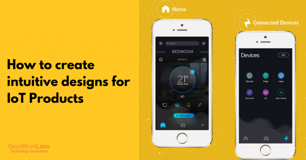
How to Design for IoT Products

Designing an intuitive dashboard for IoT Products

Smart homes are soon becoming a more acceptable norm of society now with devices such as Amazon Echo, Google home, Alexa etc. But it is not just the technology that makes these products a massive hit among customers. A lot of thought has gone into designing such user-friendly IoT products.

As a product engineer or a UX designer who is working on an IoT project, your main focus is centered on creating and designing a product that brings immense value addition to your client.

UX design for IOT

One of the most crucial designs in IoT products involves the look and feel of an IoT dashboard which serves as the touch point for the user to interact with the device.

In this blog post, we are going to talk about the 4 steps involved in designing an intuitive dashboard for IoT products.


1. Break down the User Journey:

Take this a thumb rule – before you even get to the stage of picking up your pencil and sketch pad, spend some time to research and understand what kind of IoT product are you designing for?

It could be anything ranging from a smart system that controls the lighting of the house to a smart refrigerator that sends updates on the grocery list or a super efficient home locking system.

For better understanding, let us take the example of designing an IoT dashboard for a smart refrigerator that allows the user to track the details of grocery items and to set up reminders in the user’s mobile to stock up items.

Now, before we get down to designing this dashboard, as a product designer you first need to understand the underlying technology that will be used by the refrigerator such as, what kind of sensors would be triggered, what kind of data will be recorded, how will the data be analyzed etc.

Your job is to represent this underlying data in an intuitive manner. This is where your creative mind kicks in and is expected to think about the user journey and different use case scenarios. Also, while designing it is very necessary to be mindful about the target audience who is bound to use the product.

In the above example, the smart fridge is going to be used by a household which would include:

  • a family of 4-5 members
  • the users could be aged between 24 to 55 years
  • the user could be either male or female
  • pet-friendly house

Now based on the above user scenarios, you will be able to sketch out different user journeys.

2. Create the Skeleton with Wireframes

This is the fun part because here is where you actually visualize each and every action of the user. Some people call the wireframe stage as setting up the blueprint of the design and functionality of the product.

wireframe

Now, when you are designing the dashboard of an IoT product, it is necessary that you visualize each and every step of the user and jot them down into squares, circles, and triangles. The key here is attention to detail. Step into the shoes of the user and think of the ways he/she will use the product on a real-time basis. Document scenarios that are not so obvious but have a probability to pop up.

In this stage, you also get to logically test the flow of user actions. Yes, ‘Logic’ is the word here. Don’t just go by your gut or instinct, you need to think if the steps in your wireframe make logical sense in the bigger picture. Sketch out as many possible scenarios here. Do not restrict your mind to – ‘this is it’! Explore different options and also be conscious to capture different user emotions while sketching the wireframes.

Don’t just put a button because it has to be there. Think of how you expect the user to navigate to a particular page such as – to check the grocery stock, to get alerts on food items that are running low on storage, setting timers for bakery products etc.

Once you have a gamut of ideas, sit down and evaluate the best possible user flows to create an unparalleled user experience (UX). This is the most important part of the whole designing process and so it is imperative that you get it right. The UX is the make or break deal for the success of your IoT product.


3. Bring your Product to life with Visual Designs

For all those creative artists out there, this is the stage where you need to find the Picasso inside you and splash those colors into the wireframes. But don’t just add any color – keep in mind factors such as color psychology and branding guidelines (if any) while choosing the colors.

color theory for visual designs


Let us go back to our example of the refrigerator dashboard and see the kind of colors we could use.

It would be advisable to use a lot of white space in the design to give it a neat and easy user interface (UI). Also, depending on the USP of the overall IoT product, either blue or green could be a great choice of color for a dashboard.

If the highlight is more on the technology, then blue would be an ideal choice as it showcases intelligence and is a color that is most commonly used with electronics. But let’s say if the USP of the IoT product is to highlight health or any environmental benefits, then green would be an excellent choice to complement the messaging. Also, colors such as red, yellow and green can be used to indicate any functionality features to the user.

So, in a nutshell, while you are creating the visual designs keep the end user in mind and choose colors that are able to communicate instantly with the user.


4. Test your Designs – Time to Prototype:

This is the last and final stage of the design process where your designs are put to the ultimate test. With the help of many online tools such as Adobe XD or Invision, you can test your designs in real time and showcase the functionality to your clients.

This real-time feedback helps you to iterate designs on-the-go and incorporate all feedback at one point. It is important that all designers prototype their designs since quick and responsive designs translate into happy clients.


Thus, designing for IoT products can be slightly different from creating mobile apps and websites as User Experience is the key here. But with the above-guided approach, you can be assured of designing a vibrant and intuitive dashboard for IoT products


[leadsquared-form id=”10463″]

Offshore Development For Dummies

Understanding Offshore Development

You’re comfortably relaxing on your couch and enjoying a football match. The television suddenly switches off and the switch box explodes with sparks flying around. You have no clue what has happened and you look up on the internet searching for an electrician. The local electrician is charging $100, whereas a veteran electrician from the neighboring community is ready to visit your place and rectify your electrical setup for just $30.

Whom will you call?


OffshoreDevelopment-Example


Keep these options in your mind as we dwell into the concept of offshore development.

From the past decade or so, an unexpected trend has arisen in the technology sector. Multi-national companies, start-ups, and even local businesses have started adopting the business models of offshore development services. Offshore development was something that only large global companies engaged in many years ago due to the geographical and language challenges that existed. Today, these are not a factor as communication and transparency challenges have been both negated due to the technology that has come into everyday life.

First, let us discuss what exactly is offshore development as well as why it has become such as a popular option for companies worldwide.

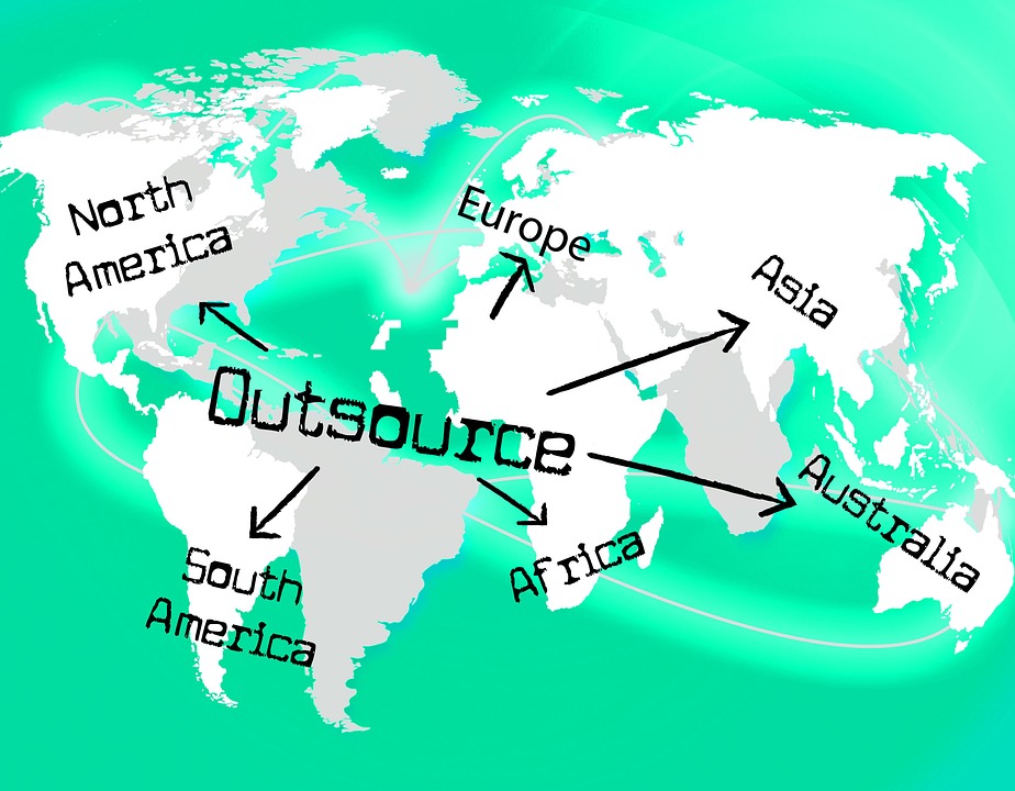
Offshore development means the process of outsourcing your development needs such as web, mobile or even custom software to countries such as India, Philippines, China and so on. The reason why people look at offshore web or software development is mainly because of the cost-savings and the time that can be saved. Also, it minimizes internal overhead costs. The offshore model has been around for a long while but with the world becoming more global and technology making it easier than ever before to communicate to anyone no matter where they are located, the demands for offshore development have increased substantially.

Offshore Development Outsource

The Offshore Development model is used for multiple things: offshore software and offshore web development or services such as customer service, data-entry, cold-calling along with BPO or KPO processes. The main reason is that a person in India or any other developing country will cost significantly less when compared to the US, UK or Australia. The bottom line is that if you are able to find a good offshore development partner, you can really save yourself time, money, HR hassles and other operational expenses. The key is to find a good offshore partner who has the experience, expertise and technical skills to accomplish what you need. Ranging from a simple website or even a fully operating customer service center, your offshore partner must be well equipped to handle your requirements.

Professional offshore development can be beneficial in the following ways:

Reasonable services :

Not all the countries boast of a talented pool of web developers and designers in abundance which makes it difficult to get work done at a nominal amount. The reason being that they charge substantially as they develop products knowing that they are in monopoly. It turns out to be quite expensive build a website or mobile app. Offshore development can disrupt the monopoly and be more cost effective.

Quality:

One of the best things about the offshore software companies is that they have a vast pool of talent and can render top notch development services. This ensures that the quality of the projects is superior and also matches the international standards.They also ensure that they utilize the best tools and technologies to create highly competitive products.

Communication:

Technology has ensured that there is no delay in any communication between the client and the developers. Offshore developers tend to be more approachable and communication friendly. This ensures that the process does not go haywire during any stage.

No deadline delays:

Following deadlines is a big aspect when it comes to product development. The entire marketing and operations of a company depends on the product being delivered according to the stipulated time. Offshore development can cut down these hassles as they have the flexibility of employing more resources at a lower cost.

24×7 availability:

Round the clock availability sometimes becomes a norm for a global company and offshore centers offer workflow accordingly which might not be possible in the parent country due to cost and labor-force constraints.

Conducive Environment:

Outsourced processes, usually are very strenuous in nature. The workforce needs to be seated in an environment that can boost productivity and reduce stress levels. It is one of the main factors why Offshore Development is a good option since infrastructure is available cheaply as compared to the parent country.

Security:

Security of confidential data and client properties is a buzzing concern when dealing with offshore companies. Most of the offshore development companies offer high end security protocols and systems to ensure the client’s data is never compromised.

And now, back to the electrician conundrum. If a veteran electrician with years of experience is ready to travel to your house at a cheaper rate, any sensible man would choose him over the $100 electrician. The same logic may also be applied to the concept of offshore development.

So, sit back and relax as your offshore partner takes charge of your processes and product development and frees you of the basic organizational hassles.

offshore development-Solution

Offshore development may seem a far fetch off for most of the most organisations, but if the current global trend is to be observed, it is one of the most trusted and cost effective options for an organisation that is looking to cut down on costs and build quality products.

How to be a strong willed UX designer?

Challenges for a UX Designer


According to LinkedIN, there are 900,000 UX designers in the world. How strong willed are you to be one of the best in the long run?

“ Determination is the wake up call to the human will”

A designer is a commercial artist confined by factors such as economical efficiency, technological constraints and most importantly a client’s requirements.  A UX designer is more skilled in the techniques and the process on a whole new level which we will not dwell into. And as seen with artists and designers, even UX designers can lose their way in between or simply succumb to mental fatigue unless the work flow is organised and their creative persona is kept alive.

So, what exactly are the obstacles a UX designer faces?

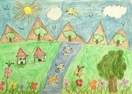
To answer the above question, let us just assume you are 6 years old and in elementary school. The task at hand in the art class is to draw the conventional scenery with a sunrise and a small house.


Basics of UX designing


You have an hour to complete the task and your creative and young mind sketches out generously on the canvas. Agreed, it will not be the best work of art but for a 6 year old child, it is commendable.

Now, let us add factors one by one to transform the 6 year child into a UX designer.

  1. The client, the teacher in this case, wants an enhanced amalgamation of colors that are soothing to the eye.

  2. Instead of crayons, you will use the latest tech available to make it more interactive: the fish in the rivers should pop out when touched, the canvas should have interchangeable themes according to the time of the day and everything should look lifelike.

  3. Instead of an hour, you have a week, in which you have to start from the scratch. Create a storyboard, research how different users react to the design, predict how users are going to interact with the picture on different levels to name a few.

  4. And now, most importantly, you are not supposed to cross a fixed budget, redraft the design until the client likes it and stick to a deadline.

  5. You’re in your 20’s now, you have had experiences as a human being and your creative side sometimes has a slightly different point of view.

And thus begins the constant battle between your creativity and someone’s exact requirements. Being a 6 year old was fun, being a UX designer is much more fun stacked up on a heap of obstacles and opportunities. So, how to go through the ardent process while enjoying it and keeping your creative ego on a standby?

Remember:

You are special. You are sketching the future of technology. It is a part of you that people will see when they access the digital world. You have already predicted what they will feel, how they will react and that is nothing but pure magic! Not an illusion, not a cheap trick, but a result of your skills and ingenuity. So, as far as you keep this in mind and adjust to a few requests, you are already strong willed to be one of the best in UX designing.

Still, here are a few tips to keep yourself clutter free and determined:

  1. Ask yourself why is the client/business spending money on UX design? If it is so important can I afford to lag behind and deliver an under-performing product?

  2. It is good to have infinite concepts for a project but stick to a concept, believe in it and keep refining it. The more choices you have, the more fatigue you will experience even before starting especially when you have a deadline.

  3. When we are unsure of what to do, we usually look towards a social behavior to guide us. Avoid that. It is your design, a proof of your brilliance.

  4. People not only perceive object shapes better, they respond better to action oriented stimuli. Allow this thought process in your creativity.

  5. Be clear of what exactly you want from your design, see your design on an emotional level for the future user.

  6. Every process has its hardships, but visualize the end result that will boost your confidence.

  7. Anything beautiful and alleviating takes time and effort to be created. It is your mind, your space and your canvas. Realize it proves your worth as a person and as a professional.

  8. Divert your mind from social and family matters and engage in healthy conversations with your co-workers.


Being a UX designer, perhaps no one will ever know who designed the masterpiece android/iOS mobile app that they have gotten addicted to. You are designing for everyone and no one at the same time. Either your passion for designing and challenges provide the spark for you or it is the growth opportunities. There will be times when you will be agitated, every creative soul goes through that. In fact it is imperative. All that pressure, all those suggestions and yet every time if you come up with a design that startles everyone, you will be the silent guardian that ensures the success of products.

A creative knight in the shining armor of technology.


UX Design Intern’s Experience at GoodWorkLabs

The award-winning UX Design Studio at GoodWorkLabs kickstarted the internship program in 2015, where in we take few bright and innovative design students to take up interesting projects, solve real life problems and build beautiful & usable products. Megha Chawra, a B.Des student from MIT, Pune, successfully completed her internship of 5 months.

Our HR team asked about her experience working with our team and how useful was her stint here at GoodWorkLabs. Let’s read her experience penned down and shared by her.


Megha-ux-ui-design-intern-goodworklabs

“Goodworklabs is one of the fast UIUX growing company in Bangalore. I was a UI/UX intern for 5 months and in these months I had the great experience in learning the whole system of a Mobile and web applications from research to development and testing process.

The company follows a structured process of User experience called Lean UX. Starting from understanding the needs of the client’s product, we nail down towards research module particularly in user personas, comparing other similar apps etc. Coming up with the key priorities, we start developing the information architecture and wireframes keeping the end user in the mind. Then, while doing the visual design I learnt to explore in color schemes, layout and interaction styles, right usage of fonts.

Once the designs are done, the very most important technicalities which I learnt was to understand the requirements, challenges and work structure at the development side of the app i.e asset creation, spec infos, device and resolution sizes of both iOS and Android which we generally tend to ignore while making the visuals.

Overall, It’s a great place to learn and improvise the skills. Have developed the capability of patiently managing the needs of the clients and the developers. People over here are very friendly, supportive and fun to work with. Working here have built my confidence in digital designs.” – Megha Chawra, B. Des final year student, MIT Pune, India.

To apply for internship program at GoodWorkLabs, send in your application along with your profile and work to [email protected]

Our Thoughts to Get the Gaming Experience Spot-on

A gaming environment is quite an interactive parable. It is said to be an adventure experience that can evolve to being more than a real world’s journey. As a game designer, you serve a group of people who are ruled by their passion. Together with a great user interface, you also need to work on an immersive journey that will make people forget reality and embrace the world within the game. As such, a game designer is nothing less than a superstar for the gamers. Here are some nuances that help you get the right gaming experience to your audience.

Gaming Experience

Knowing the Emotion you want your Player to go through when playing

The key to creating/designing the perfect gaming experience is asking yourself “what do I need the player to feel in the course of the game”. Is the core objective of the game to inspire excitement, mystery, fear, sense of adventure, or insanely challenging? The “Impossible Game” should be a perfect example to bring out now, wherein users feel challenged and stressed apart from the frustrating title! These emotions should be deeply laid out before you even begin writing the storyboard. “Knowing the emotions” can act as a guideline to your story and the game architecture.

Develop a Prototype Accordingly

Now that you know what you want your user to feel, start developing a storyboard that instigates the objectives (the apt emotions). This is where the story is conceptualized and requires a lot of creativity to be pitched in. Users need to be guided to your objectives using scenarios, animations, sounds and virtual rewards/recognitions. Even the gaming graphics can leverage a sense of emotions when put in place. This should be the purest state of your game.

Choose the Test Player Wisely

Before releasing a game to the end users, you need to practically test whether the real use case has been able to live to the “objectives”. Every developer offers his creation to a ‘test player’ who is meant to give the first valuable feedback for further refinement. However, be sure that the test player clearly defines your end user. To take an instance, if you have been working on a game that is meant for kids between the age of 5 and 10, you cannot have a test player who is middle aged employed person. Consider the test player as your first user and make sure he/she is capable of providing a appropriate yet relevant feedback.

Add More Suitable Elements to Bring a Zing to the Game

Now that you know the quality of your game and the suggestions for improvement, it’s time to add other additional ingredients that will uniquely identify your game from others in the market. It’s just like dressing the turkey for a delightful presentation. However these additions should also again strictly comply with your game objectives. You simply cannot have a funny clown dancing to nursery rhymes if you are trying to create a horror experience.

Compare Initial Game and Newly Refined Game to see if the Expected Experience Comes Across

The second and final process of review is to ensure that the new changes brought into the game design/environment puts the right thoughts across. If you could visualize more integration, go for them. Your game should be able to ace the gaming experience.

Is your website designed well? Yes. But is your website coded fine? Well…

As a business owner looking to expand your online presence, you might have typically experienced the whole-hearted dedication with which web designers and developers focus on getting the website design aspect right. But are you confident that the site has been well coded and that any coding issue doesn’t impact the SEO or user accessibility chances of your website?

Coding for Website

Why is it critical to get the programming right?

As a web surfer yourself, you might have come across a number of poorly rendered websites that look good but suffer from one coding problem or another. Since you will not be able to see the poor coding, but just its harmful impact, you will simply close the site and move on. This is precisely what happens to badly programmed websites; the business owners lose prospective clients, are ignored by Google algorithms and can also land you in legal trouble.

When it comes to industry standards in W3C compliance, programming and markups, you do not have to be a developer to sense a potential issue. The below 3 reasons will be good indicators to alert you of a problem with coding of the website that you can then bring up with the web developer and get it corrected.

1. SEO – This is a key reason why your website needs to be well coded. Try comparing two websites – one with good markup and one with poorer markup. Google will readily rank the website with good markups better than the other one. Elements like character encoding, RSS validity or valid metadata denote a W3C compliant website that will in turn be favored by Google.

GWL tip#1 – Try using a validator program such as one on http://validator.w3.org/ that checks the markup validity of HTML or XHTML pages

2. User accessibility – Imagine closing out your website to a certain section of people because of accessibility issues. You are not only excluding possible revenue generating audience but also face a probable legal infringement lawsuit. Having a well coded site means that it will work on older browsers or older machines. It also means that people with disabilities can still access the website with ease.

GWL tip#2 – Try out the W3C knowledge resource http://www.w3.org/WAI/intro/people-use-web/principles to see how you can implement this particular factor within your website

3. Usability of backend – With so much content generation and social media sharing these days, it is no surprise that a good content management system helps maintain the freshness of the site with periodic content updates.  Having a CMS integration also helps engage better with customers and in sales conversion.

GWL tip#3 – In case your company has in-house team of developers, let their creativity flow out with a little help from http://modx.com/

You can even go one step further and proactively ask your developers if these responsibilities are being performed by them. This way you do not have to wait for the problem to crop up and then get it rectified. As they say – prevention is better than cure!

Ready to start building your next technology project?