11 Prototyping Tools For Designers- How to choose the best one?

One of the best phrases from the world of design is

if a picture is worth 1000 words, then a functional prototype is worth a 1000 meetings.’

From pure experimentation to see your vision turn into a tangible project, prototypes help a lot in the phases of testing and building. The best thing they do is the fact that also take care to preserve the overall design uniformity too.

Designers are under an obligation to design things according to the description of their clients, but not all understand the requirements clearly. Several meetings, emails and phone discussions then follow. All of these are done to arrive at a final design.

This hassle, though, can be avoided to a large extent by the use of correct prototyping tools.

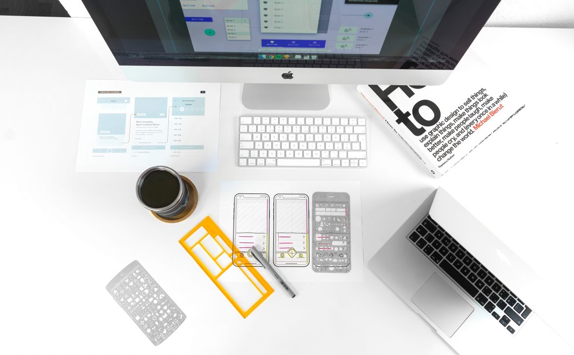
Prototyping tools help the designers and clients to collaborate in a better way and not have any creative differences. The clients get a visual idea about what will get created. The teams too, build a better understanding and explore options becoming visible, only after building and testing.

The most crucial advantage of prototyping tools is the risk involved, because the sooner we get a failure, the faster we can learn. Failing in the initial stages gives us a soft landing. You have the opportunity to work and improve on those errors.

11 PROTOTYPING TOOLS FOR DESIGNERS

How are Prototyping Tools Used?

We know very well that user experience is a critical metric for the branding of any company. Companies, therefore, use different prototyping tools to show different versions of a product to clients as per their requirements. It allows the UI/UX designers to put a ‘Proof of Concept’, an essential factor for a stable commercial relationship between the customer and the client.

How to Choose the Right Prototyping Tool?

Choosing the right prototyping tool is the key to describe your thoughts and collaborate in a better way with your clients. However, getting the right prototyping tool is not easy. This is because there are too many tools available online; enough to confuse you to pick the best one.

Every tool is different from the other because each one either lacks a particular feature or has an added one to stand separate from the others.

To choose the right kind of prototyping tool for design, a few factors need to be evaluated to check if the tool addresses our requirements or not-

A LEARNING CURVE

It is essential to analyze how easy the tool is to adopt. In other words, a learning curve where it is determined how long it takes for a designer to understand the tool.

SHARING ABILITIES

Because collaboration is crucial in design, the perfect tool will be the one to provide a collaboration feature for multiple people and stay in sync with each other.

USAGE

This is another point to know when choosing a prototyping tool, about how well it merges with your design process and other tools you use regularly.

COSTS

There are several prototyping tools, and many of them have niche features. A lot of these tools fail to meet our budgetary needs, though. Hence, it is better to choose the tool according to costs and not just by the features on offer.

The 11 Top Prototyping Tools for UI/UX-

INVISION

Invision is the most popular prototyping tool available today. With its project management page, it is effortless to organize the design components into a status workflow.

Invision has simplified every single aspect of the workflow and collaboration between design and development. Better, faster and more collaborative design in real-time is what Invision does best.

ADOBE EXPERIENCE DESIGN

Adobe XD allows you to draw, reuse and remix vectors and create artwork and build wireframes, interactive prototypes, and screen layouts in the same app.

With Adobe, designers can be more productive as they can import files from their Adobe tools without any trouble at all. Clients too, can make comments on your shared prototypes and look at the designs in real-time.

ORIGAMI STUDIO

Facebook initially created this tool for helping teams build and design products. Origami enables you to show your designs in a presentation on full screen on various devices.

You can also export prototype components by a single click, and engineers can copy-and-paste in the project. The tool is more suited to freelancers just starting, due to lack of collaboration features.

SKETCH

WebSketch has a lot of similarities with Photoshop, allowing the user to edit pictures. The fully vector-based workflow makes it easy to create beautiful and high-quality artwork from scratch.

With Sketch, the reusable elements like lines and bubbles can be automatically copied and pasted.

AXURE

Axure is a tool providing some very powerful prototyping without any coding. It also makes the process of sharing a prototype for the team or client very easy.

Axure will also publish all your diagrams and prototypes to Axure Share on the cloud. With a single link, others can view your project in their browser.

WEBFLOW

The most significant benefit of Webflow is that the tool provides a very high degree of functionality without the need of writing a single line of code. The tool heavily focuses on web animations, interactions and very responsive web design.

You can either host a prototype with Webflow or even export the code in HTML, CSS or JavaScript.

FRAMER

Framer has the premise that with the right code, it is possible to prototype anything, resulting in beautiful designs. It provides an effortless workflow, further eased by version control, device previewing and easy sharing.

Framer also makes it possible to import graphics directly from Sketch, Figma or even Photoshop.

ATOMIC

Atomic is a web-based prototyping tool and requires Google Chrome. The tool provides you with the flexibility to tune your interaction. There is easy access on offer for all developers with a simple shared prototyping system.

The best feature is the history option, allowing you to rewind to previous designs and create new versions from any point.

PRINCIPLE

Principle has been built for OS X and has an iOS app to watch live prototypes. The app appears a lot like Sketch and other aspects like alignment, art-board creation and real-time previews.

Principle also permits designers to work offline at increased speeds so that you do not have any problem with a slow connection.

JUST IN MIND

A significant advantage of Just in Mind is that it can be downloaded on your system for offline work as well.

The tool comes packed with tutorials and guided videos for everyone, who is a beginner or even an expert. You also have access to use items from UI libraries and then download several other add-ons.

BALSAMIQ MOCKUPS

Balsamiq Mockups replicates the speed and convenience to create mockups on paper but at a digital medium. Designers get to choose from more than 500 pre-made icons or components.

If you are not a professional designer but looking for a tool allowing you to create static and straightforward wireframes, Balsamiq is ideal for use.

Still not sure, how to get on with it? Let us assist you, Contact us.

How to improve your Site UX Design to Maximize Conversions

UX design is the backbone of a website. The whole UX design process is responsible for creating your site the way you always visualized it, and how a customer will see your website on accessing it.

UX design is a procedure of enhancing the user experience, or user satisfaction by increasing the overall efficiency, and usability of a website. When we talk about conversion rate, it is directly related to the UX design of the website. This highlights the importance of a great UX designer for any business.

What is very important to note that a great UX design involves several factors than just an intuitive user flow and an appealing layout. A good UX will entirely change the way a user browses a website. It is bound to bring more traffic and increase conversions.

An improvement in the User Experience will convert your website visitors to business leads, buyers, and even brand loyalists.

How-can-UX-maxmize-conversions

Ways to Improve the UX of Your Website:-

It is not very difficult to look after ways to boost the aggregate experience of your website.

These four ways serve the purpose for you just as effectively:-

1- Have an Easily Visible Call to Action Button

Call to action (CTA) buttons have a significant role in guiding the users for conversion. The most commonly used CTA’s are: to sign up for updates, start a trial, download the app, schedule an appointment, and a lot more.

Furthermore, having a clear and appealing CTA button always provides excellent experience on a website. This Call to Action attribute deserves a space on every website page. There is no denying that sites with clear CTA buttons bring more conversions with them.

To add to it, if your website has several folds, your CTA button should be above the fold for easy visibility to the users.

You can keep a few more things in mind for CTA buttons-

  • The color of a CTA button has a lot of importance. The use of specific colors can provide a lot more visibility to the button. Try to use contrasting colors for CTA’s when compared with the color scheme of the complete web page.
  • The text on a CTA should be action-oriented. Passive verbs are strictly not advisable. This text needs to be subtle but active enough to make the user take the desired action.
  • The word count, while writing the CTA text, should not exceed more than five words.

Having a visible Call to Action button is very imperative to provide users with a great experience.

2- Control your 404 Errors

When a user looks for something on the web, they expect to land on the exact web page they were looking for in the first place. If they fall on a page error, like 404 in most cases, it will take them no time to switch over to another website for a faster experience.

It becomes very apparent that 404 errors have the potential to take active users away from your web page. What is also evident is that these errors can never be completely taken care of.

This is why a question arises- How to accurately take care of this problem?

  • The first way is to find out those pages where the search results show 404 errors and fix them as quickly as possible.
  • Instead of allowing your website to display a standard ‘404 error: page is unavailable’ message, you can get some customization done for the error messages to make things a little friendly for the visitors.
  • You can take the help of some relevant, pleasing, and entertaining images for the error page to reduce the anger and frustration of a user considerably.
  • Convey to the users that you are the provider of a very smooth and comfortable browsing experience. For doing that, personalize the error text to add a personal touch to it.

It is crucial to know that you cannot eliminate these error texts, but taking enough care not to irritate the visitors will always be an added advantage for your UX.

3- Make Use of Authentic Images

Images have the potential to enhance the appeal of any web page instantly and make the content more authentic and believable. The kind of images you use can easily make the entire call of the page is good or bad.

To be sure about the images you use, the first advice is to keep away from stock pictures. Using them is always cheap and very easy, but they tend to be more harmful than beneficial in the long run.

These stock images do look professional, but it is never difficult for the users to understand that they are stock images, and such behavior will make them lose their interest.

Original and authentic images always attract more visitors because they bring a realistic touch with them and ensure connectivity with the users. The stock images, of course, become repetitive and bore the visitors.

If you use stock images for your web page, it sends a wrong message that you were lethargic in investing your efforts to design your website. Stock images will not allow your site to look unique, as users will most certainly have come across the pictures before.

You should make it a point to use only original images, irrespective of how basic or simple they look. The key here is to stay away from stock photos at all costs.

4- Ensure a Quicker Page Loading Time

If your web page is guilty to load slowly, it is enough reason for users to eventually abandon your site and go to a website having a quicker response time.

So, if your landing page is slow, there is a high probability that visitors will not even go through your website entirely. Also, you should also take care that just improving the loading speed is not going to be enough. Optimizing your website for mobile users is also very important.

Conclusion

Providing a lot of relevant information is not what User Experience is about. It is about how interactively, and how engaging are your efforts to ensure that information.

You might have a great product to show, but if you fail to catch the attention of the user, it will never be enough.

If you wish to have a website with all the trending practices for a great User Experience, we can help you. Get in touch with us!


7 UI Design Tips for Dashboards

The Importance of UI Design in Dashboards

Why to put a lot of thought into dashboard design?’

The answer is simple! Because your dashboard is the first thing that users will look at while interacting with your product.

It has to be understandable in one glance to be usable. Besides, all the brilliant technologies such as AI, Blockchain, Machine Learning are useless to the users if they are not presented in a user understandable way.

This is why dashboard designs require a thorough thought process.

Given, the importance of the dashboards, today we would like to address the popular query i.e. ‘how to make a great dashboard UI’.

But, before we dive into  the tips to make a perfect dashboard UI, let’s discuss the characteristics of a good dashboard:

UI Design Tips for awesome dashboard


  • An effective dashboard is a visual board for simple conclusions of a rather complex set of information with a call to action. This means the dashboard provides information on which the user can base his decision on.
  • A great dashboard is easy to understand and presents all the key insights.
  • Besides being extremely intuitive, a good dashboard is easy to customize.
  • In a very limited space, great dashboards exhibit all the crucial piece of information

Now, the point is how to come up with a dashboard which can pass for the above characteristics. Here are a couple of notes regarding the visual design that one must keep in mind while designing dashboard UI.


1. Be consistent

To be consistent means to have undeviating design across the dashboard. The design should be consistent on all the devices of varying sizes.  The functionalities in terms of fonts, colors, elements’ placement, navigation and style charts also need to be consistent.

The golden rule is to design the smallest screen first.

This approach helps in creating appealing spaces for more important information first and then leads you towards creating a great UI which enhances the abilities of the UX as well.


2. Simple customization

‘One size fits all’ approach is not the road you would want to take. Simple Reason being, usually there are multiple user roles with varying priorities and needs. Also, the designs ought to be scalable. Users should be the choosers on how they want to customize the design as per their business needs.

A good dashboard design should be able to accommodate all sorts of complexities and should allow for easy customization as and when required.

Some design tips that you could use:

– Permit easy modifications like field addition/ deletion

– For a customizable dashboard, use easy drag and drop interaction

– Cater the user with multiple color themes, if feasible

– Allow multiple options for viewing/downloading data


3. Communicate the necessary information first

With visual design, the vital information can be communicated to users in a usable and appealing manner. Also, with the crucial content placed and finalized, the design guidelines and layout can be easily defined.

Points to remember:

– The card layout is recommended because it allows concise data classification, along with scalability and flexibility.

– Users perceive the center portion first so the central alignment is preferred.

– Maximum font size should be 18 Pixel

– To highlight any important information a distinctive color should be used.


4. Prefer simple charts

Usually, in order to come up with fancy visual representation, designers get drifted and adopt complicated charts. Keep the charts simple and try to present all the variety of ideas in an easily understandable form. The main reason being charts are the prime data visualization tool for the users and should be easy and concise so that the user can perceive the information in one go.

Points to remember:

– Prefer pie charts, bar charts, and line charts as they are easy to understand and fit well in complex places.

– Use flat design charts instead of 3D charts, they are neater and easier.


5. Pay attention to the iconography

Icons are very small components of the dashboard but they hold great significance. A great dashboard should have icons which are familiar.

The reason being that a dashboard is frequently used by users and are accessed for prompt information or actions. Therefore, familiar icons reduce the processing time and deliver better performance.


6. Keep color psychology in mind

Colors are more vocal than you think.

Just as how traffic signals communicate to us with red lights signaling us to stop and green lights allowing us to drive, color psychology is important in UI dashboards as well.

A great dashboard should be designed with mindful colors and any possible confusion should be avoided.

Points to remember:

– Avoid going overboard with the colors used

– Try and leverage contrast colors for better visibility


7. Use the right font style and size

It is very important to keep both font style and size consistent while designing the UI and UX of a dashboard. It is highly recommended that not more than two font styles should be used. With minimal variations in font style, the dashboard holds a neater appearance.

It is advised to create a visual hierarchy of the written content for better visibility. This can be done by placing the crucial information in the larger font size and probably with different color and less important information in relatively smaller font size.


Summing up

All the above tips will help you to come up with a great dashboard UI but studying the user’s requirement is the first step before all these. It is easier to design a dashboard once you are through with user’s preferences and style because then you can customize the dashboard around the specific needs of the user. A useful dashboard is way better than a well-designed but unrelatable or complex dashboard.

An unrelatable dashboard is one which is not knitted around the individual business needs of the user. For example, a corporate dashboard for a school. The UI of the dashboard makes it great or just okay, the choice is yours!

At GoodWorkLabs, we have some awesome dashboard designs to exhibit for your perusal. Our team of experts can help you bring life to your ideas and create eye-catchy UI and UX designs.

5 Design tips For Blockchain Technology

How to design for Blockchain Technology

You might have read thousands of articles on how Blockchain is proposed to bring transformation in the world we live in today. In the next few decades, the possibilities will unfold into opportunities, it’s just a matter of time. Currently, we are just beginning to understand what Blockchain is and how it can be applied for our benefit.

If you are a designer, it will be a really tough task for you to design for a concept which is barely understood by its users or potential users.

5 design tips for blockchain technology

But, an early bird always stands at the favorable side. Today, we are laying down 5 simple rules to follow for creating the UX design for Blockchain. After reading this feed, your curiosity about design for Blockchain will get satisfied.

Let’s begin:


1. No Jargon

Jargons can make any concept difficult for a layman to understand and use. As only a handful of people are involved in using this concept, your focus should be on how to attract more people to use Blockchain and how to benefit from it.

Terms which are already floating in the market such as Dapp, DLT, and altcoins make Blockchain overly technical and highly complicated. Also, the Blockchain industry has a bad reputation of being a phony scheme of getting rich quick.

To subside all these barriers is not easy and making Blockchain easy is the first step towards design. As a designer, it is your responsibility to make your project more likable and user-friendly. To achieve this, promote ‘no complicated jargons’ approach and focus on the value that can be delivered to the users.

In short, unexplained jargons can kill your design.

2. Break Down Barriers to Entry

The market is currently segregated in two kinds of people. The minority of them are determined and excited about the Blockchain and majority of them have no idea what it is and feel like outsiders. It is like an impenetrable bubble for them to understand and get excited about the whole Blockchain technology.

To penetrate the bubble is like to walk past a Bermuda triangle and not get lost. As a designer, you will face terrible UX and might feel completely blank at several stages. The reason is that this technology has hardly evolved much and there are only a few people available to explain the core concepts and walk you through the process.

The key to get through this is to make the Blockchain usable to the layman. Simplify it to the core!

Make it so easy that every person with internet access can use it. Here, ‘Coinbase‘ can serve as an example for you.


3. How strong should your security be?

People consider security as a major setback of cryptocurrency since all the funds are in a digital wallet, and if stolen, there is no way back and nowhere to complain. There is no authority regulating this. This makes the security of the funds very crucial in order to make the users feel secure and to trust your product.

To keep the account secure, you should offer 2-factor authentication (2FA).

But, here is the twist. If you mandate the 2FA for all the users there will be a lot of friction at user’s end and then you won’t be able to deliver a seamless experience.

To overcome this problem, keep 2FA recommendatory and mandatory for new users. Also, 2FA should be mandated for major fund movements to keep the security tight.

This approach will keep the users at peace and deliver the optimum amount of security.


4. Maintain transparency with the users

In Blockchain, if you deploy something, it usually takes time to process and get finalized. The length of time that it will require is never fixed and it also depends upon how busy the network is. The time taken for completion may range between 5 minutes to 2 hours.

In this situation, to deliver an acceptable user experience, don’t keep the users waiting around. Be transparent with them as users like near-instant actions.

To manage the user expectations ask them to come back in few minutes and report the current status as accurately as possible. Even better, send them an email update when it’s done.


5. Design Thinking

Blockchain has been promoted as the problem solver technology for many industries. Most industries have begun to turn to blockchain technology for solutions now. As a designer, it is important for you to define the problems precisely and design products that can actually solve such real-time problems.

Promote the practice of researching and user testing to indeed create valuable products. It is essential to penetrate through the hype and get original user insights.


Final words

A product designer’s real job title is ‘Problem solver’. As a product designer, you are bestowed upon with authorities and even bigger responsibilities. Blockchain technology may pose some friction in your already smooth design career but it will be a great learning opportunity.

Till now, the Blockchain technology has been more focused on the development part. The design on many exchanges and Blockchain websites is still in the latent stage.

To make the Blockchain technology usable for the layman, designers should work on simplifying everything. With the effort directed in the right direction, Blockchain will no longer be a mystery but become a part of our daily lives.

Are you unsure of doing this on your own? Let us help you! At GoodWorkLabs, we have a team of radical designers who strive to deliver simplified Blockchain solutions. Let’s have a word!

7 tips on UI Design for FinTech Apps

UI Design for FinTech Apps

Do you have a wheel swirling Fintech app idea and are wondering how its UI should be like?

You have stumbled upon just the right article as we are here to help.

We sure know that presentation takes a major pondering before launching an app. As an experienced team of mobile app designers, we would love to share our thoughts on ‘What should be kept in mind when UI of Fintech App is on the table’.

First of all, Fintech has emerged as a major industry in the last decade. Its significance can be sensed with the contribution of £6.6bn to the U.K. economy in 2016 and employment to 60000 people and growing. 

The signature products of this industry are digital banking, online trading apps, and e-wallets. Now is a good time for existing financial market players to launch their own app or to redesign their existing apps.

Most of the Fintech apps have either poor or confusing user interface which requires the user to take a pause and understand the app first. Such complexity of Fintech apps defies the basic purpose of having the app, i.e to initiate smooth interactions and hassle-free transactions. 

In this blog, we have created an exclusive list of notes for designers and entrepreneurs to deliver a widely accepted and user-friendly user interface for FinTech Apps.

We also created a video version of the blog to help you quickly glance through the top tips on UI designing for FinTech Mobile Apps.


1. Focus on User Behaviour

As the B. J. Fogg’s Behavioural Model suggests a user should be motivated to use the app.

Q1: Are you solving any problem?

If yes, how quickly and smoothly are you solving it?

The app should be able to solve a persisting user hardship or bring something new to the table like enhancing user convenience.

A best-seller app will be a combination of both. To achieve this, it is essential to study the business first.

It is very crucial to grasp the client’s product basics, knowledge of target audience, and stakeholders. If you can inculcate any tricks of the trade to the mobile Fintech app it will add an edge to the interaction of the application.


2. Simplify information 

The apps which are considered as leading mobile Fintech apps, condense the mass of data to relevancy and are very easy to use.

To make the app interactive and simple, you need to work on page layout, content display, and task flow to begin with.

Other important pointers are to keep the frequently used tasks upfront and easily accessible to the user. Also, transform bulky financial data to graphs, or charts.

Immediate call-to-actions should be placed to help users take the desired actions. Detailed information should be available when asked for.

This practice enhances the user’s confidence in smoothly handling their finances through mobile Fintech apps.


3. Choice of Background

App background is worth consideration as it is directly related to the app efficiency. The target audience should always be kept in mind before picking an app background.

While the light backgrounds are very popular in Fintech apps, dark backgrounds also come with their own set of pros and cons.

Dark backgrounds are great when it comes to presenting graphic content but are not very helpful when the app is operated on mobile devices with poor displays.


4. Font selection

Some recommended fonts are Lato, Roboto Condensed, and Titillium Web

You can always pick another font but ensure that the selected font should fit in compact spaces without affecting the legibility.

Also, check the appearance of individual characters like $. This is necessary because the finance world revolves around numbers and figures and you don’t want to have a leaning dollar sign in your app.

This conveys that the frequently used characters should be tested for flexibility and legibility.


5. Charting Styles

The key is to use simple charting styles which is comprehensive and familiar to the users. The Fintech apps come with various limitations like Frameworks and APIs, so there is not much that can be done with the charting styles.

To make it user-friendly just keep them clear easy to read and understand.


6. Gamification

We shouldn’t take the fun out of an app just because it’s a Fintech app. When you are making UI advancements on the app, it is good to consider gamification.

App gamification increases the user engagement and efficiency. Add colors to your imagination and gamify the app with elements which will not only help users enjoy the transaction journey but also enhance user satisfaction.

At this point, we would also caution you about loud elements that don’t support seriousness involved in financial transactions or things that can be a distraction for the user.


7. Color palette

You remember how they say, ‘take the world and paint it red’.  Don’t!

A color palette is the most crucial thing that can affect the UI of an app.

Fintech apps are for several purposes including banking and stock markets. One needs to keep the data visualization in priority while selecting the color scheme for the app.

In the case of any stock market-related app, red and green colors hold great significance but it is important to keep the rest of background in a light color so that these colors can stand out.

Enhancing data visualization is the key here.


Summing up

Last decade has witnessed some of the revolutionary Fintech apps with a smooth user interface and awesome responsiveness.

Besides the basic app functionalities, the user interface helps the app to stand out from the competitor apps.

However, for Fintech apps, the market is still not ready. Users resist opting for online options of banking or investment because of the risk involved.

Facts have that only 3% of  Indians are actually using the online versions of Finance handling, thus reducing your target audience.

To build user confidence, you need to keep your Fintech app simple and grievances-free because when money is involved user might not give your app a second chance.

Tips to get you started with your UX user research

What is User Research and Why should you do it?

Research, as we all know, is a crucial aspect of any undertaking, be it shopping for clothes or building your own backyard nuclear-powered submarine. Especially if you are a UX designer, research is quite important to understand the what people want from the product that you design. Without a clear understanding of what your users’ needs are and what they expect, you might as well be throwing darts in the dark. Unlike designing, user research is almost a never-ending process which needs to be carried out throughout the product’s lifecycle. However, in this article, we will focus on the user research for designing and what you need to know when you are starting out.

UX research strategy

Where should you start?

There are a lot of points from where you can start your research depending on the nature of your product. A hypothesis of your current objectives will provide a picture of the goals you seek to achieve through the research.  

1. Introspection

Before starting the research process itself it would be a good idea to try and define your product, the basic function it would serve and the demographic it is intended for. At this point, discovering the problems users presently face in the market would help define your products’ purpose. Analysing the market demand and your chances of proliferation would also be a wise strategy at this stage because going back to the drawing board because of an overcrowded market is never a good contingency.

2. Conceptualization    

Identify various business demographics that you feel might be interested in your product and understand their real-time user goals. Conducting surveys, interviews, focus groups etc. are among the many methods that are commonly used. The data achieved through research can be broadly classified between qualitative, quantitative, attitude and behavioral. Using the all the information and feedback thus received to create a rough iteration of the design.


3. Research Methods

  • Surveys

Surveys are often an easy way to start out with UX research. With online surveys being a huge trend today, it is not hard to find participants. However, the ease of finding participants hardly makes up for the level of inaccuracy involved in this process as most people tend to give biased responses. Short surveys with simple, well-worded questions involving both open-ended as well as multiple choice questions tend to work best with this method.

  • Interviews

Interpersonal Interviews are one of the oldest, tried and tested methods of understanding users and getting to know them. Interviews offer a great deal of flexibility when it comes to questions and ensuing discussions that could lead to a higher level of revelation. Compiling a valid set of questions and putting them through a trial run before the interview to check their feasibility will help. As always the interviewer must remain calm and composed and make the user feel comfortable before the interview. Engaging the user to get the most out of them would be a good idea.

  • Focus Groups

Engaging a small group of people in a discussion on your product and its potential can bring out valuable insights and ideas. However, this process has a good chance of backfiring as groups tend to follow a herd mentality eventually leading to supporting the popular opinion rather than their own which ultimately can produce inaccurate data. Allowing each person in the group to express themselves properly is the key to success when dealing with focus groups.

  • Usability Testing

One of the most effective methods of UX research is usability testing. This method involves putting the target users through a set of tasks designed to demonstrate the features and functionality of your product. This process can be leveraged to derive valuable inputs. Although not as elaborate as with questionnaires, usability testing provides the most accurate data and feedback. There are several methods of usability testing as well as tools that can aid in carrying out the processes.

4.Analysis

The data derived from these research methods can be analyzed and compared with your initial hypothesis. By doing so you will get an idea of the changes that need to be done. One of the advantages of UX user research is that it can be done at any stage in the development process and it’s up to you to choose the most valid method at your current stage.

Conclusion

When it comes to UX it is easy to lose your way with designs and most of the time designers end up designing the product with their own needs in mind and that of their investors as well. Research here can offer a neutral perspective and bring out the best ideas that users can identify with. While each method has its own advantages it would be ideal to use them in combinations to paint a wholesome picture.

Why Product Thinking is important in UX Design

How to use Product Thinking in UX Design

The original premise behind user experience which is often understated is the fact that lies in its namesake itself- to make the user’s experience with any product better. Product designing is an intricate and complicated process where the designer could get lost in a coded web and in all the ruckus it is easy to ignore the user’s needs. Designers can hardly be blamed for doing so because every product has a fundamental purpose it tries to serve which defines its existence.

The features of a product are hardly of any consequence if they don’t satisfy individualized needs and goals. This redundancy factor is what prompts a need for more comprehensive strategies like product thinking.

Product thinking in UX Design

What is Product Thinking?

To put it in simple terms product thinking is a strategy where the product is the sum of all the users’ expectations. Here the users are the instigating factor and the product becomes the end result. The common pattern followed with product thinking is as follows:

Start with the user

  • What is the problem your product would seek to address?
  • What is the target audience?

The Job at Hand

  • The idea behind it?
  • How would you go about executing it?

Your Expectations

  • The goals you seek to achieve.
  • The resultant features that come out of the aforementioned efforts that would go into your product.


Product before Features

A common flaw when it comes to designing is the amount of emphasis that designers put into features. While features are important, for most designers building a product means creating a preset of features that will eventually define it. This is where they lose touch with what the user actually needs. With product thinking, the idea is to visualize the product during inception as it will be presented to the users. The features are then added in to complement that idea and build the ideal product.


Defining the Product and its Purpose

The level at which user experience is today, understanding the user is not that much of a task. With such valuable resources at their disposal designers get a clear picture of their target audience, their issues, the vision behind the product and its end goals. However, this part is easier said than done because when it comes to users their problems are often latent and it is up to UX professionals to uncover them.

Once designers comprehend the purpose why people would purchase their product in the real world, they can create a rough idea of what the product would be like, what it would mean to them and what ends it would serve. Once this core aspect of the product is laid down, the features will automatically fall in place and the designers can tweak them in any way that would ultimately enhance the user experience.


Problem vs Solution

For a designer, there are many ways to go about solving problems with a product but understanding the heart of that problem is what sets the bar for innovation. Many see problems as a prosaic concept where consequence translates to causation. But, in the real world problems with a product can be anything. In some cases, things that are seemingly negligible could be causing people to walk away from your product.

The complication here is that people themselves seldom realize this fact. The users know that they don’t like the product, but they can’t explain why. So designers have to delve deep into the psyche of the users to understand the problem and fix the product and its features.


Conclusion

Product thinking in its essence is the combined effort of everyone involved in a project. It is as abstract as a concept as to implementing it. Yet without it, a design is nothing more than just a UI. The layers of research from both the product management and designing point of view leave little room for doubt when it comes to users.


Why User Persona is important for UX Design

Getting to Know User Persona for UX Design 

A vital part of User Experience design or pretty much any business-based technology, user persona can be defined in simple terms as a virtual representation of your typical customer. Derived from user research and web analytics a persona serves many ends for UX designers. A persona usually includes qualitative and quantitative information of a user’s personal attributes such as their behavior patterns, likes and dislikes, needs, ambitions and so on. A persona can also be defined as the collective representation of a particular demographic using a typical user which the designer can use to relate. This also provides you with a valuable tool while trying to pitch ideas to stakeholders, designers, and anyone who is involved in your project.

user research for designing

How do you Create One?

There are a multitude of ways for creating a persona. But the most commonly followed ones are those from user experience research methods. Through interviews, casual interaction and such, one can ascertain enough information about the user and build a profile of their general attitude, character, and behavior. While direct research methods are quite commonly used, web analytics also plays a large contributing factor. Social media websites and applications and search engines too are valuable sources of information to create such a profile.


A persona usually consists of the following aspects:

1) Personal Information

Vital information such as name, age, marital status, number of kid etc. are a staple in all personas. Usually accompanied by a photograph, this statistical information helps build a clear demographic profile of the user.

2) Environmental Data

Information pertaining to the users’ social life, work life and the technology they use and so on. This helps build a profile of the surroundings they live around and the kind of company they keep and their work ethics and profile as well.

3) Psychological Data

Information regarding their personal interests such as food, movies etc. along with their attitude, strengths, weaknesses and pain points can all be found in the persona as well. These give the profile a human touch beyond the rather mechanical statistics.

4) Personal Ambitions

One of the more inquisitive features of a persona is the information regarding goals and ambitions. While other information is quite vital, goals and ambitions provide an idea of exactly what the user needs, and how your product could influence if not help achieve it.

5) Scenario

This is the final aspect of a persona and is created based on all the aforementioned aspects. The users are put in a typical real-life scenario and an analysis is made on how they might interact with your product.


What are the different type of user personas

While most user personas are created from actual users, to serve your marketing and designing agendas, some organizations build personas without any actual information. These are called proto-personas. While proto-personas like regular personas are used as a means of actionable insights, their information is usually the result of guesswork and experience using which people create their own image of their typical customer. The reasons for this usually are either time or budget constraints or both.    


So what do you do with user personas?   

The most fundamental purpose of a persona like mentioned above is to serve as a communication tool while pitching ideas with your team and anyone else who is involved in your project. For a designer, a persona serves as a guideline and inspiration to design the product for a particular demographic. All the information pertaining to the users’ emotional and psychological state along with their interests and goals allow the designer to clearly conceptualize what the product should be doing and how it will be serving them. The organization as a whole can also gain valuable insights and stay in tune with their customers’ lives.   


Conclusion

Despite the many research tools available today, user persona serves as a reliable tool for both designers and marketers to understand the product and their users. The plethora of small information available in personas generally helps out more than elaborate details on a particular aspect of the user. Additionally, when you have access to multiple personas, the common points between them serve as a deciding factor.

4 UX Guidelines to follow for an immersive Chatbot Experience

UX Design for Chatbots

If you look at the market and business trends, Chatbots are available on almost every list. All the big businesses and brands are leveraging chatbots. On the other hand, small brands are planning to have one for their business.

Experts say that chatbots are going to cover about 85% of customer service related interactions in the coming years. However, the popularity has also increased the demand for a quality experience. Hence, businesses can’t compromise the UX design of their bots in any manner.

Sure the functionality of the bots matters a lot, but it is the user experience of the design that brings customers again and again.

UX Guidelines to follow for an immersive Chatbot experience

Here, in this article, you will find the most valuable UX guidelines to create an impressive chatbot for your business.

1. Make it easy to understand

The initial impression matters the most in your chatbot design. The users should be able to understand the functions and the processes of the chatbot very easily. Only then, you can expect them to come back for further interactions.

So, make sure you include exciting and helpful elements in the onboarding process of the chatbot. This will make the design more impressive for the users.

2. Add elements to maintain the conversational flow

Many times, the users don’t realize that they are interacting with a chatbot. So, if the bot does not maintain a conversational flow, the users might leave and never come back.

To avoid this, it is important to add elements that can help you maintain a conversational flow. A chatbot can ask pre-defined questions or present suggestions to the user. These elements in the design help out the user throughout the conversation. Some of the advanced chat platforms such as Facebook Messenger and Kik leverage such elements in their chat methods. These platforms offer regular response suggestions during an ongoing conversation, which helps the users.

3. Give it a consistent personality

The personality of the chatbot is probably the most important UX design component. The goals should be to attain consistency. Plus, the bot should sound friendly during the conversation.

To achieve that, you need to focus on providing clear diction capacity and simple language to the chatbot. Use a vocabulary that is generally used in the common language. This will make the conversations more smooth and friendly.

4. Prepare chatbot for anticipated issues

A conversation between a human and a chatbot presents some difficulties. Sometimes, a user might ask an invalid question or a query, which won’t allow the Chabot to answer. However, that should not stop the conversation. Your design should get the user on the right track for the conversations to flow. For that, you can include polite reminders of the purpose of the bot. The bot can provide suggestions and tips to help the user ask the right questions and queries. This way, the conversation won’t end in the middle.


So, in this way a good UX can help you create an impressive chatbot and also create immersive user experiences for your customers.


8 Expected UX Design Trends in 2018

UX Design Trends in 2018

Did you know that a whopping 79% of individuals abandon a particular site if they don’t like the content? Also, with marketers placing utmost importance to content, it is only imperative that design layouts, both mobile and desktop incorporate the content experience as a crucial factor of UX design.

If you are planning to create a website with unique design ideas and are letting customers be effective with their time on the site, then UX will emerge as the key success driver.

Here’s a quick look at the eight major design trends that will rule the world in 2018!


 UX design trends 2018

8 UX Design Trends to look out for in 2018

Building an exciting website in 2018 can be tough if you don’t know the latest trends on board. The following pointers will surely help you create a stunning, unique, and fully functional website:


  • Use the power of  ‘negative space’ for Content Experiences

Minimalist design is the most widely accepted design trend and the whole purpose is to remove distractions and help the reader focus on the main thing – Content.

Negative space also known as white space is a crucial aspect while designing a web page. It offers room for creativity and also acts as the breathing space for the important elements in your website. This white space design also helps readers to navigate easily on the website without creating any visual obstacles.

However, the concept of ‘white space’ isn’t new. Crucial changes in reading habits have compelled  UX designers to incorporate this particular element. Open layouts and white space will increase readers’ focus, and it greatly improves the user experience.

The best example of using white space for a content centered experience is Medium – the single and utmost focus is to enable readers read long form blog posts without any visual distractions.

medium blogs - GoodWorklabs


  • Conversational bots

Facebook popularized Chat Bots to a great extent. The messenger app helped numerous individuals create operational bots, and the number has increased significantly. The initial figures were 30,000 and that has gone up to a whopping 100,000 today. With some of the leading companies embracing the idea of Chat Bots, effective marketing communications and customer service has become easier than ever!

Some brands have also seen a spike in orders because of the ease and convenience of conversational bots. Hence, it is safe to assume that 2018 shall see more of such interactive design features on their websites.


  • Omnichannel UX

It is time we change focus from a mobile-first design. The number of connected devices are increasing and especially with Internet of Things (IoT) gaining more popularity, it is just natural that designers thing of an omnichannle user experience now. Today’s users are more goal oriented and are more concerned with completion of that goal irrespective of the devices they interact with.

While creating an omnichannel UX, a designer should be mindful of creating a seamless flow of user journey and make it easy for a customer to transit from one device to another without any hiccups in the user experience.


  • Moving closer to Virtual Reality

Although there’s a lot to improve, VR will still make significant impacts this year. Companies will incorporate VR strategies while showcasing products. Also, designing gestures for a VR environment that are similar to the natural environment will bey a key focus to help the VR market grow. More and more brands are opting VR technology for their marketing strategies only to create a different ‘user experience’.

Hence, VR is definitely going to be a subset of the greater picture of UX design in 2018.


  • Micro-interactions are common

If you wish to accomplish or complete a single-dimensional task, micro interactions will give you the perfect opportunity to do so. Here are some of the use cases of micro interactions:

  • Feedback communication or the consequence of a particular action
  • Accomplishing individual and isolated tasks, connecting one post to the other
  • Manipulation of a particular setting
  • Prevention of user error

The flexibility to add reactions to a particular post on Facebook is the greatest example of Micro-interactions.


  • Voice User Interfaces

Technology is constantly evolving to make daily tasks of human life easy and 2018 is definitely the year where Voice User Interfaces (VUIs) are going to gain more popularity. Design is bound to slowly move focus from clicks on websites to screenless experiences.

We already have a range of VUIs such as Siri for Apple, OK Google for Google, Alex for Amazon and Cortana for Microsoft, and a Gartner survey also suggests that 30% of our interactions with technology will happen in a more conversational style.

Hence, designing fro VUIs is going to gain momentum in 2018 however there is still time for this technology to mature and replace graphic user interfaces as these AI systems still need to become more efficient at understanding ‘how’ people talk about topics and the conversational flows.

voice user interface


  • Card-based designs are going a long way

Web designers and marketers are quite familiar with the ‘card-style’ design. The trend isn’t new and will continue to rule the design world. With Google implementing it into the material design, the trend seems to have a bright future.

The card design layout helps to showcase a lot of content in a clutter-free way on smaller screens. Also, the card layout helps to maintain design consistency across different devices such as mobiles, desktop and tablets.

A good example of the card-based design is again Medium where tons of content is displayed in a neat layout and it also makes it easier for the user to find what he is looking for click.


  • Smart and Personalized designs

Brands are moving away from a one-size-fits-all approach to a creating custom tailor-made experiences for each individual user. Also, with advancements in AI and Machine Learning, today companies have enough and ample data about user behavior, buying patters, interests etc.

Design also will now cater towards creating more personalized user experiences to enhance interactions with the brand. This is bound to take personalization and brand experience to the next level.


Conclusion

We looked at some of the key UX design trends that are going to take dominate 2018, but like they say, trends come and go, but what matters is that we continue to design and build products that touch people’s life. If you think there is an upcoming design trend that needs attention, let us know 🙂


Ready to start building your next technology project?