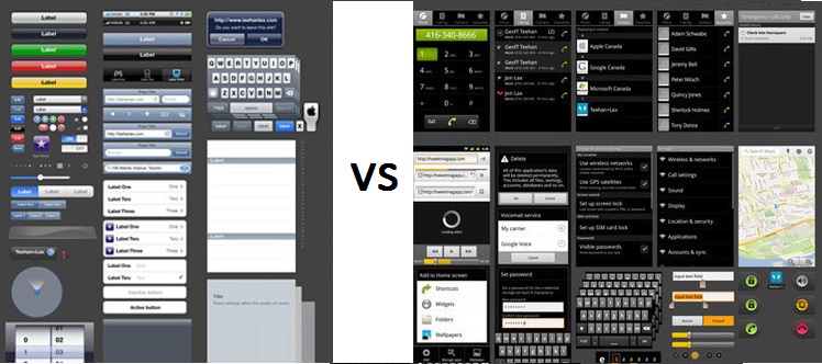
Last week (https://www.goodworklabs.com/avoid-cross-platform-app-design-mistakes-by-knowing-more-about-these-distinct-android-elements-part-1/) we had an interesting look at how the spurt in demand for Android operating system has spawned a whole new generation of developers seeking to gain expertise in this challenging yet captivating domain. We continued by looking at how developers tend to re-use iOS app design elements in Android app design and how the common design element unique to Android need to be considered in order to provide an enriching user experience to Android app users.
Some of the common design elements that are found only in Android ecosystem and not in the same form in iOS will include
While we covered point1 in our earlier blog (https://www.goodworklabs.com/avoid-cross-platform-app-design-mistakes-by-knowing-more-about-these-distinct-android-elements-part-1/), we will now continue with other Android-specific design elements that developers need to be careful while porting iOS design elements to Android –
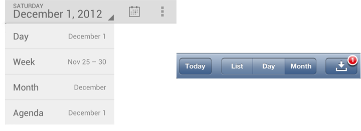
2. Spinners – In Android, selection out of multiple options is enabled by the spinner element. They are extremely easy and versatile to use, and can be used across a multitude of functionalities within an app. One common usage is for data selection in form. For instance if you’re looking to fill up ‘State’ information is US, you might be presented with a spinner that reads a list starting from ‘Alabama’ and ending with ‘Wyoming’. Of these states, you can select one that pertains to your details. In iOS, this is taken care of by iOS action sheet. An example is the calendar that shows different design for Android and iOS.
3. Tab navigation – The key difference between iOS and Android in tab navigation is the placement. While iOS recommends placing it at the bottom of the page, Android suggests keeping the tabs at the top. Remember the different tabs that come up in Google Play Store – ‘Top Free’, Top Paid’ or ‘Featured’? These are the tabs placed on top in Android that allows relevant navigation.
4. Screen size – Since iOS develops apps only for Apple devices, the screen sizes are pretty much standardized (though the advent of iPhone 6 and iPhone 6 Plus, change just change all that in Apple). Thus, when using iOS elements, developers need to ensure that they also work on a mind-boggling variety of Android device screen sizes – from 3.5 inch to 7 inch. This huge fragmentation of screen size and device capability brings is own set of design challenges. Android developers need to ensure that their designs are fluid and supple to suit all screen sizes on Android.
Our take on this – Of course development costs do matter, but it should never be at the expense of UI/UX needs of the Android user. When it comes to deriving top class user experience, it is not an option but rather a necessity. Android itself has a great user experience to offer, and extracting the maximum from these unique Android-only elements/functionalities is a good way to enable this. Let us know if you know of any other element that is singularly unique to Android and which needs to be altered specifically if taken from iOS environment.