As of Q3 2013, Android commanded a staggering 81.3% of global smartphone shipments1. With such a huge market, it is certainly a rewarding career opportunity as an Android app developer. An Android app development company has a challenging task of keeping up with industry evolutions and shifts in customer preferences.
Also, iOS and Android together commanding a mind-boggling 94.7% of market share in Q3 20131 in terms of operating systems. Considering this fact, it is no surprise that companies will look to port their existing Android app development proficiencies in making iOS app too or other way round. Many developers tend to begin their app development project by assuming that they will devise an app for iOS too concurrently. While this does work to some extent in bringing down development costs, what if the expenses of cross platform app design mistakes is higher than the benefits provided?
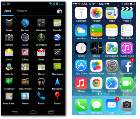
This is precisely what we witness when we try to do too many things at one time. It is a common pitfall to try using a previously designed iOS and simply trying to tweak the iOS experience to suit the Android ecosystem. Though there are similarities in navigation or basic elements of UI, the actual modality in achieving native UI/UX experience is what convinces us to treat Android as a separate development project altogether.
Our take on this – If we know the common mistakes that occur by using iOS designs for Android, and take care to avoid/repeat the same, we can still achieve a distinct look for both iOS and Android app by using most of the elements/components from one platform to another. Today, in this first part of a 2-part blog, we look at some such unique elements in Android that is completely different from iOS and should be accounted for specifically, when porting iOS elements.
The ‘back’ bottom button navigates to previous screens and continues doing so till it reaches the Android home screen, even it means traversing across multiple apps in the process. In the ‘up’ arrow however, it will go back one level only till the time it reaches the main view / first view of the app.
Next up in the 2nd and concluding part, we continue with some more Android-specific elements that need to be looked into when executing cross-platform app design to achieve a fabulous native Android app experience.
1 – http://thenextweb.com/mobile/2013/10/31/strategy-analytics-android-smartphone-shipments-81-3-q3-2013-ios-13-4-windows-phone-4-1/