4 Advantages Of A Responsive Website
“You put water into a cup it becomes the cup,
You put water into a bottle it becomes the bottle.”
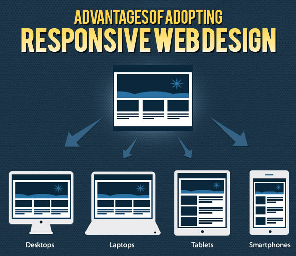
A responsive website is something like water. It can take the shape and size of the device you are visiting it on. It also helps you stand out from the crowd. Times have changed and more people are online from their mobile devices or tabs. Hence, it has become a necessity to have a Responsive Web design that can be accessed by anyone, anywhere and on any device without an issue. There are several advantages of having a Responsive Website, but we list you the Top 4.
#1 – Because Google says so!
Google is the God of all search engines and we are sure you want to get a high rank here. And, guess what Google loves? Responsive Websites. They feel this is the best Industry practice that you can follow. A Responsive Web Design has the same URL and the same HTML no matter which device you use. This makes it easier for them to index and organize the content. This is basically very user friendly as all the content is available on one website and on one URL. This makes for easy browsing and sharing.
#2 – SEO is the last word
SEO is the last word for websites in the current scenario. If you have a good SEO strategy that usually assures that your website gets a higher rank on the various search engines. Having one website means having one set of hyperlinks. This reduces the hassles of maintaining the website and helps in focusing on how to increase the reach with a consolidated Search Engine Optimization (SEO) strategy. It is not economically viable to have different SEO campaigns for different devices. With a Responsive Website the focus then narrows down to just one link. Thus, making strategies and tactics for every device easier and SEO effective.
#3 – Let’s Save
Needless to say, that adopting Responsive Web Design to your website would lead you to saving a lot of time and more importantly money. By testing the development, support and maintenance across a number of websites, the overhead charges increase. This can easily be avoided by maintaining a single responsive site, as there will be less content to manage. This also means the high bounce rate, which mobile websites usually face, can be combated. Less bounce rates mean more footfall on the website, which obviously means more out of less investment.
Also, for businesses and individuals who don’t have a need to create and publish a mobile app on the app stores (be it iOS, Android or Windows), responsive websites save a ton of money because you also cater to your users on mobile through a good website that can be optimally used on phone or tablet screen through the browser.
#4 – Be in the loop
Responsive Website is the most ‘in’ thing and a necessity today in order to flourish your online business. With the growing number of mobile phone and tablet users, soon all websites will have to have a Responsive Web Design in order to sustain. Since the new trend of online shopping has completely taken over, not having a Responsive Website would end up with you losing customers or users. Also, remember, not everyone would like to download your app due to a variety of reasons (hassle of downloading, the bandwidth issues, the memory the apps eat away, etc.). So responsive websites then are a must.
We strongly feel, that a Responsive Website is the key to expand and make your online business a success. It not only makes managing the SEO strategy, but also provides a great user experience across any device.
Want to build your responsive website? GoodWorkLabs specialises in building beautiful responsive websites with great user experience. Contact us today.