Google’s Material Design – A Quick Rundown

Android Material Design

Most of you might already know about the latest version of Android OS, i.e. Lollipop. Also referred to as Android L, this version has turned out to be quite popular for one crucial reason – Material Design. Though there is a sustained interest in this design philosophy, there are very few pieces of published content that actually touch upon a holistic perspective of this radical new design thinking. Today, let’s check out some vital factors of Android L.

Why Material Design?

If you closely analyze the elements of Lollipop, you would find some significant differences when compared to the conventional Android aesthetic. The new design would seem more similar to a pastel and paper adaptation of the Metro theme from Microsoft. In the past four versions of Android, a lot of variations were seen mainly due to the branding done by the different carriers. In the previous versions of Android OS, the user interface lacked consistency. The elements in the previous versions were so inconsistent that they used to react differently in different situations, even though they were a part of the same OS. Similarly, there were few more negative aspects in the last four versions of Android that led to the inception of Lollipop.

What Lollipop’s Material Design Has to Offer?

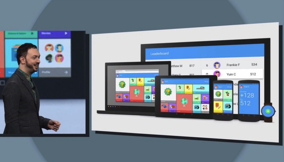
One of the prime objectives of the Material Design is to strengthen the trust between the software and the user. The strict rules mentioned in the Material Design add more consistency to the way the user handles or interacts with the OS. This new design allows the user to drag objects more swiftly, add and destroy items, and choose the type of interaction to occur on UI elements. In other words, through the Material Design, Google has made an attempt to make the OS react in a way that the users expect. In this way, users will not come across any hiccups or unpleasant surprises.

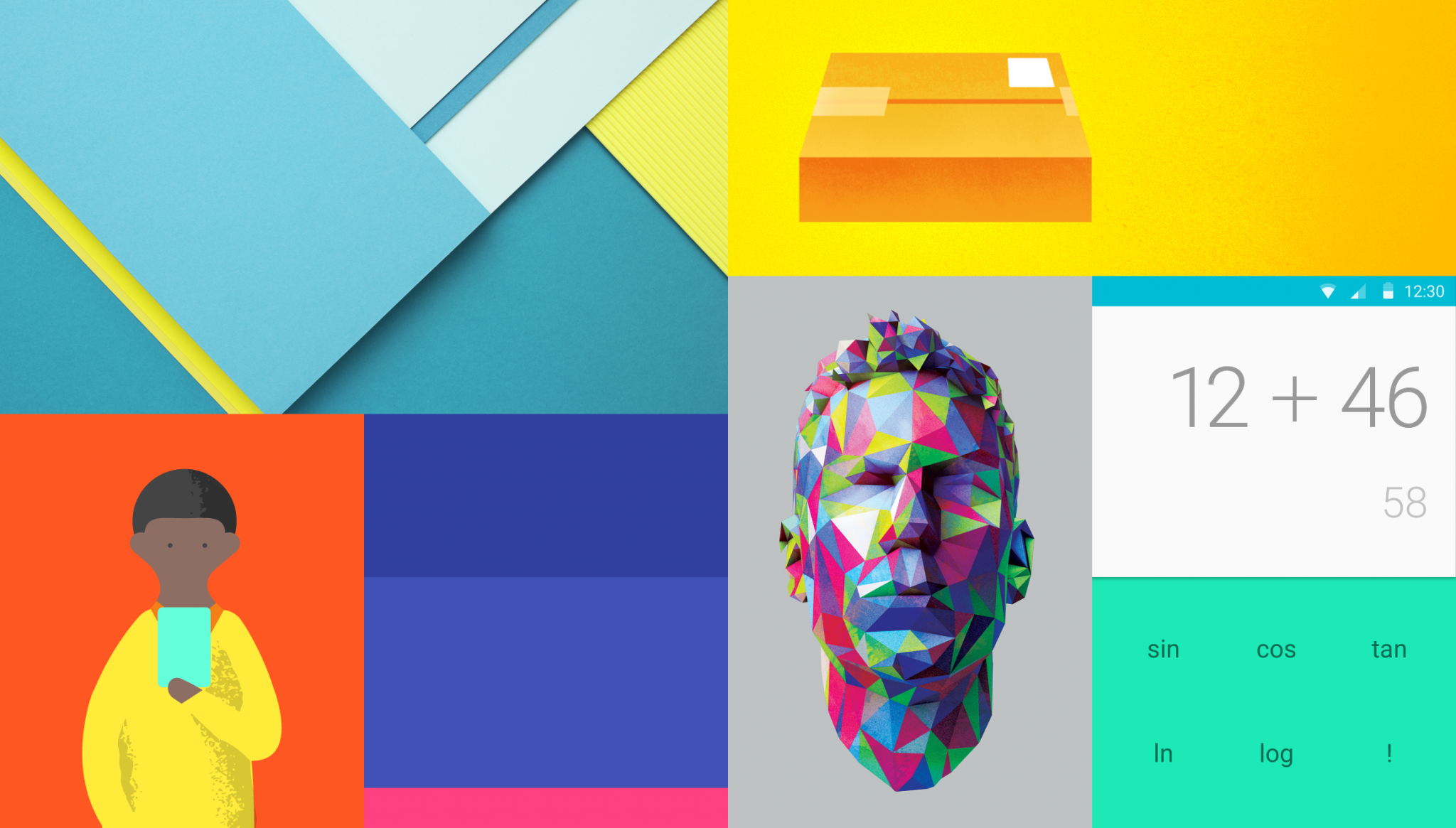
Smart Paper- It would not be wrong to say that Smart Paper has been the core symbol of Material Design. Smart Paper can be defined as a concept that involves a fictional element, which is able to move and alter shape, accompanied with depth. I would definitely say that the Smart Paper concept can be compared to a magical notepad having layers of papers or cards. The respective cards come into action as you tap on them, and you can even drag and rearrange them. Meaning, the cards are quite flexible in nature, however predictable.

Virtual Physics- Yes, this time Google has gone a step ahead to improve the UI. Virtual physics concepts have been used in a detailed way to decide how the elements should move, how fast should they accelerate, how they should spring back, etc. Getting the elements off the screen and changing their size has become easier now.

The Appearance and Feel- The Material Design gives a lot of emphasis on the use of consistent graphic design, mainly across the OS and apps components. Numerous color palettes have been incorporated into the design, and the fonts have been standardized to give a better feel to the users. The level of contrast related to the texts has also been optimized for better reading experience.

Let us know in the comments below if any other aspect of Material Design has kept your interest level high.

Android – Trend in Material Design

Android Trend in Material Design

Android Lollipop has been hailed as a revolution, making smartphone interfaces better looking and more functional. There were several changes to the previous version of KitKat. In addition, Google also worked upon a lot of bug fixes while plugging in several helpful features that attaches exceptional power to the OS. The first device to get a taste of the Lollipop was Google’s Nexus devices. Gradually, third party manufacturers like Samsung, Sony, HTC and Asus caught up with the update and users worldwide have consequently got the intuitive experience of unique functions like Sense and TouchWiz.

Android 5.0 Lollipop Review: Material Design

The biggest change with Android Lollipop (5.0) has been the material designing. This version of Android presents flatter                 icons, bold color bars, and simpler shapes. There has been a total revamp of the design language, first time seen with Android OS. In fact, this kind of material designing is nothing new. We had seen Apple pick up on the same line in 2013. With Android Lollypop, everything looks rounded, cleaner and notably flatter.

The ‘techie’ appeal is more consumer-friendly and cuddlier. Even the action buttons have been simplified to represent the basic shapes. A white background replaces the transparency that we saw with Android 4.4 KitKat. Also, the multitasking screen is now presented as a rotating cascade like the Google-Now cards. Even if you had several documents open in one app, you can access them separately from this screen.

Android Lollypop Review: Notifications

The notifications panel has certainly matured much with the Lollypop. Google finally introduced the long awaited lock screen notification that allows you to see the events without having to unlock the device. The lock screen showcases text messages, appointments and email. All it requires is a tap to go straight down to business.

In case you are busy with something else – watching a movie or reading a book, new notifications will appear briefly and choosing to ignore it will get you back to the thing you have been doing.

Android Lollypop Review: Google Now update

Google Now has already been proving to be pretty useful but soon enough, it will be getting increased support through third party applications. A month after the launch of Android 5.0, Google already had more than 30 third party vendors who would be providing information for Google Now.

Android Lollypop Review: User Accounts and Pinning Apps

Phones are no longer serving a single individual. The very capability of smartphones make them a perfect gadget to be used everyone in the family. The same devices will be used by you, your kids, your spouse, your brother, and other close family members. Consequently, Google offers for several user accounts with the Lollypop. Pinning Apps on the other hand will ensure that the second user wouldn’t be able to access things like personal emails, social accounts, and other accounts.

Android Lollypop Review: Smart Lock, Tap, Go

Lock screen security can be easily breached. This raises the need for some extra functions that protects personal information at all times. Smart lock allows you to pair your device with trusted accessories like cars and fitness wearable. Face Unlock too gives a unique perspective to unlocking the phone.

Android Lollypop Review: Project Volta

Project Volta is aimed at improving the battery life of your smartphone. It ensures that the apps connected to the phone gobble up less amount of power.

Android Lollypop Review: Verdict

Minor setbacks aside, Android Lollypop is a game changer in all respects. Improved functionality, better interface, better security and an increased flexibility of customization, makes it the best version that Android has ever made.

Ready to start building your next technology project?