A user-friendly interface is one that can help in effective communication and ensure that things are done in the right manner. The user interface of a website thus has a crucial role to play to increase its online traffic and repeat visits. The job of a web designer or a mobile app designer is to create the interface in such a way that the user finds it easy to complete his or her actions.
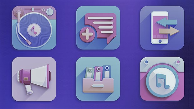
But what role does an icon play in this? App icons are just apt for interfaces since they are able to express the meanings without using words. The catch here is whether the icons can convey the core idea to its target audience or not. They should be designed carefully to bring out the objective of an action or a product. Icons provide other benefits too like improving aesthetic appeal and saving the real estate of your mobile screen or desktop. Moreover, a majority of the websites and apps use them since it is a pattern with which users are quite familiar.
What can impact the functionality of an icon? Though icons offer innumerable benefits when designed properly, there can be issues if the functionalities get hidden. This means the icons fail to communicate their usability due to design errors. The most important job of an icon is to support the online or mobile users on where they need to go next.
Check out some of the ways to select the best icons for your app or a website so that your users enjoy using them.
The basic function of the icons is to help the visitors to enjoy a smooth navigation experience in your website. Choose icons with visuals, which the users are already familiar with and so feel comfortable using them.
Is it your dream to see more and more users download one of your apps on their mobile phones? Your icon can create all the distinction between the app getting overlooked or being immediately recognized.
Keep your icons simple. Avoid using too many images or colors into the icon for your mobile app. An icon is tiny and overcrowding it with too many concepts or colors can create chaos, which should be avoided by all means. Your main intention while designing the icon for a mobile app should be that its functionality should be instantly recognized.
Your app will be competing directly with thousands of other apps when a user navigates through the App Store or scrolls through the home screens. So, you need to go for an icon that can be recognized immediately.
Since the icon does not have much space in it, when you use long words, they become quite difficult to read, especially when it is pitted against so many other icons that look equally appealing. How about using the first alphabet of your brand instead? That will enhance the functionality of the icons for sure.
Keep these tips in mind while designing the icons for your mobile app so that the users can have an enjoyable experience.